FoogRL - Final Pass on 🥳 Party Select UI 🥳
Before I tackle the final battle foes I thought I’d take a break from enemies and attacks and treat myself to some UI development, booooooo.
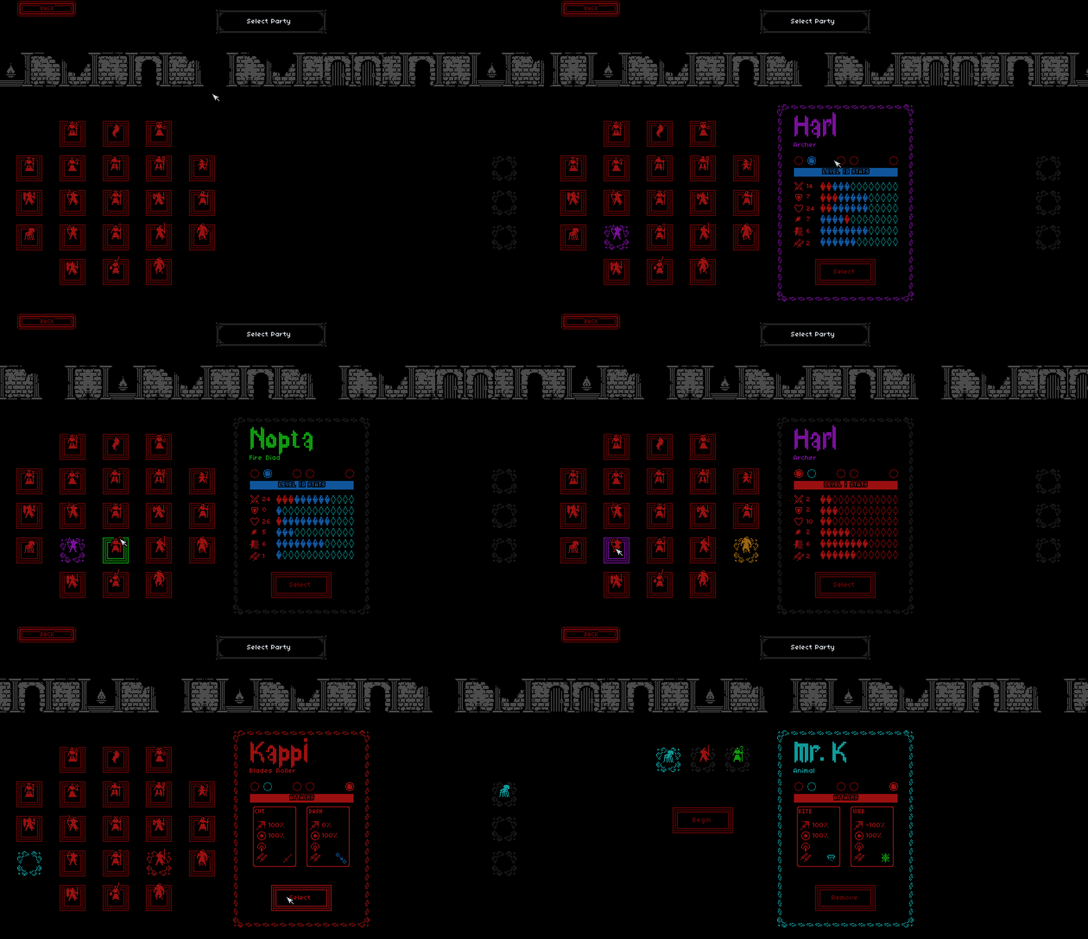
As always doing any UI changes always takes 2 weeks longer than I expect but I’m glad it’s done now, there’s been a lot of new character stats and attributes that I never retro-fitted back in the party select form, so it was long overdue. I really like being able to compare all the stats of the characters in this visual way and also being able to remind myself of all attacks.
Before
Previously I had it in mind that each attack I would create a set of icons to describe its nature, so for example icons to denote whether the attack was: ranged, affect only, multiple-hits etc… but ultimately those icons varied in usefulness depending on the type of attack so I decided a while ago to ditch that approach and just use a brief text description instead. It’s just more flexible and also clearer what everything is doing.

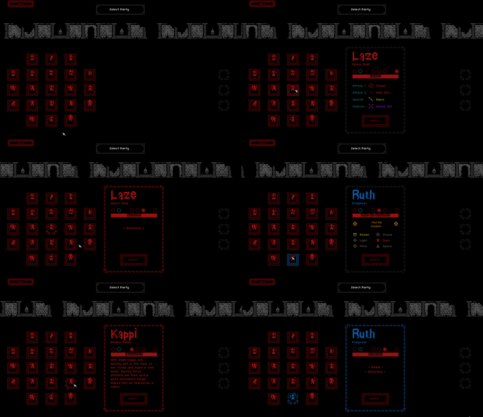
After
Also added 2 more attacks for every character since I first created this UI so I’ve been able to reflect that as well 😺
There’s now genus and alignments added to this form also, again something I didn’t have in the game when I first did this UI (let that be a lesson kids - don’t do your UI until you’ve finished adding features!)
And as well I never added the list of player abilities but that’s there now as well, so lots of new good stuff.

Next
I think I will tackle the final boss battles, wish me luck 🙀
Remaining items for beta v0.6
- Features: 5
- Bugs: 21
Foog and the Scarpeners
Command a party of dead souls. Complete the 7 trials of Foog, the dark God of chaos.
| Status | In development |
| Author | ForkandBeard |
| Genre | Role Playing |
| Tags | Roguelike, squad-based, Turn-based |
More posts
- FoogRL - New enemy: 🔮Fairy Boss 👸Aug 08, 2021
- FoogRL - Mighty Morphing Player CharacterJul 18, 2021
- FoogRL - Trial 5 - Done 😺Jul 10, 2021
- FoogRL - New enemy: 🐸FROGS 🐸Jul 04, 2021
- FoogRL - New enemy: Prockle WitchJun 26, 2021
- FoogRL - GitHub Build Actions - .NET WinformsJun 19, 2021
- FoogRL - New enemy: a fairy-summoning uber fairyJun 12, 2021
- FoogRL - Devlog kick-offJun 06, 2021
Leave a comment
Log in with itch.io to leave a comment.